
How Lessons on Depth of Field and Photography Techniques Prepare Me


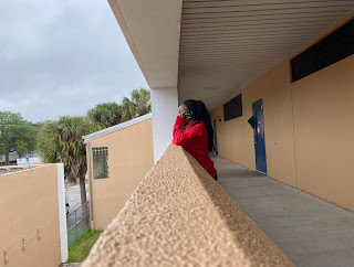
Learning about depth and field helped me expand my knowledge on the type of photos I can take and how what I focus on changes what the viewer is focusing on. When working with depth of field you can focus on the foreground or background while the part that is not being focused on is blurred out. You can change the depth of field of a photo by changing the camera's aperture. Learning about this prepared me to take pictures for my magazine that could be focused on the background or foreground.

Below is an example of the two types of depth of field:

    Focused background                                        Focused foreground


Lessons on photography helped me prepare to take photos for my magazine because I learned about so many different types of techniques that can be used for my photos such as 

- Bird’s eye view (A photo with a view from above the subject)

- Worm’s eye view (A photo with a view from below the subject)

- Rule of thirds (Dividing and imagining into thrids and using two of those vertical and horizontal lines)

- Leading lines (A line that draws the viewers eye to a point of interest)

- Isolation (When all of the focus of an image is put to a subject)

- Using available light 

- Framing (Drawing attention to something in a photo while blocking out other parts of the image with something else from the scene)

- Repetition (Repeating elements in an image)

Here are examples:

Leading lines


Bird’s eye view

Isolation

Worm’s eye view

Framing

Repetition

Rule of thirds


Comments

Popular posts from this blog

Creating a Practice Spread

Around the end of January, I created a practice spread about myself to help me prepare for my final spread for my magazine. Completing this spread helped me get a sense of putting all of my photos, captions, secondary coverage, and article altogether to create something that looks presentable and is completed.   Working on this practice spread helped me experiment with the different ways I could use fonts and colors in my headline, subheadline, and secondary coverage titles. Practice using the three types of spacing (micro, conventional, and macro) came out of making this spread as well. After completing this spread for practice, it helped me realize the things that I need to work on such as having more of a color theme, a better dominant photo, and making sure I can fit my article and captions in their spaces on the spread. Below is a picture of my completed practice spread.

Getting Started

One of the first things our magazine project centered on was creating a publication at the beginning of September. I learned how important a publication is to a magazine and the role it plays. Publications are used as a reference to magazines, saves memories, and documents their history. Some popular examples include People Magazine, Vogue Magazine, and Women’s Health Magazine. After learning about the importance of a publication and reviewing some examples, my partner and I decided that Black Art Magazine would be a great name for our own.

Designing a Layout

By the middle of October, it was time for me to start thinking about the design layout of my magazine. I began to learn about the many different elements of design. This includes pictures, copy and white space, column designs, external and internal margins, placement of the eyeline, dominant photo, copy area, vertical axis, and captions. After that, I started learning about adding more information to my layout by using secondary coverage, how to use micro, conventional, and macro spacing, and the importance of visual/verbal connections which involves the headline and dominant picture. In early November, I began to study fonts. I completed an assignment where I chose five different types of secondary coverage and then I explained how the different font I chose for each secondary coverage would add contrast, where the text will be placed, how drop and raised caps would be used, if transparency and text-wrapping will be used, and the aligning of the text. Creating a good headline was the ...